
But the devil is in the details, and Windows 8’s brand-new modern interface gets a lot of those details wrong.
Usually, we’d have to wait for an infrequent service pack to fix the little mistakes, but Microsoft’s new focus on continuous improvement gives the company an opportunity to slap bandages in hurting areas much more quickly than it ever did before. In fact, a major update dubbed Windows Blue (or Windows 8.1, if you’re being pedantic) is barreling down the pipeline, bringing a bevy of changes to make Windows 8 much more palatable.
An early leak of Windows Blue revealed several much-needed enhancements, including beefed-up syncing options, deeper Start screen personalization, and some simple yet effective interface tweaks.
Still, that’s just scratching the tip of the iceberg. Above and beyond the tweaks already found in the leak, here’s our wish list of 15 potential Windows Blue improvements that could help make Windows 8 twice as nice as it is now.
1. Boot to desktop
One design decision that particularly rankles desktop diehards is Microsoft’s insistence that users must boot to the modern Start screen. You can boot directly to the desktop, but only by downloading a piece of third-party software or fiddling around in the Windows Task Scheduler, a power tool few everyday users have even heard of. Fortunately, recent rumors suggest Microsoft may actually implement a boot-to-desktop option in Windows Blue.2. The Start button
3. Dynamic interface switching
All these desktop and Start screen woes could be fixed with one tweak: dynamic interface switching. If Windows 8 boots and finds a keyboard and mouse running, boot to the desktop. If it detects a touchscreen as the primary input, boot to the Start screen. Boom! Initial headache solved.4. Better UI hints
5. Improved default apps
Microsoft dumped its tried-and-true desktop defaults in Windows 8, swapping them out for modern-style apps such as Mail, Calendar, People, and Maps. And, sure, the new apps are pretty, but they’re missing crucial features that severely inhibit their usefulness. (Heck, the Calendar app-themed Outlook.com calendar packs deeper options than the Calendar app itself.)A recent spate of updates added some additional functionality to Windows 8’s baked-in apps, but they still have a long way to go before they’re ready for everyday contention. Bring it, Blue.
6. The ability to run modern apps in desktop Windows

7. App syncing
Windows 8 already offers a tremendous number of syncing options, allowing you to keep your wallpaper, settings and other elements constant as you bounce from device to device. And buried deep in the Blue leak were even more new sync features. The one I’m pining for most is missing, however: The ability to automatically sync whole apps across devices, so that you can transfer all of the apps installed on your primary machine to new pieces of hardware headache-free. Basically, what Android does.And while I’m on the topic, some finer-grained wallpaper syncing options would be nice, to prevent the crappy stock wallpaper found on every laptop I sign in to from jumping over to my primary machines.
8. More Snap customization options
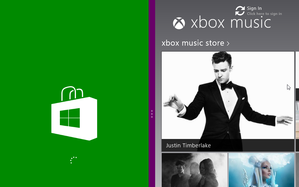
As my colleague Alex Wawro said when I asked him for wish list suggestions, “Customizable Snap view ratios is a potential minor improvement for Windows Blue that would radically change how I feel about Windows 8.”
9. Better DVD support
Windows 8 won’t play DVDs out of the box, even if you’re using Windows Media Player (which is included with the OS, but is buried behind the Music and Video apps, which are set as defaults). Sure, you can download a third-party program like the superb VLC to unlock DVD viewing capabilities, but Average Joe doesn’t know that.Even if Microsoft decides against this for economic reasons—it has to pay licensing fees to enable DVD support, after all—it could allow users of the standard version of Windows 8 to download the $10 Media Center pack, which enables DVD playback. Currently, only Windows 8 Pro users can partake in optical disc fun.
10. A modern file explorer
Even if you fully buy in to Windows 8’s vision of a touchy-feely future and pick up a device with multidigit support, the lack of a modern-style file explorer means you’ll have to dive into the decidedly un-finger-friendly desktop mode to sift through your files. That’s a major design flaw. Hey Microsoft: If you’ve coaxed someone into the Start screen, don’t give ’em an excuse to leave!Fortunately, yet another recent Windows Blue leak suggests some sort of file explorer interface is indeed coming to the modern UI.
11. Beefier PC Settings
12. Run Internet Explorer and Chrome simultaneously
If you set a third-party Web browser such as Firefox or Chrome as your default desktop browser, Windows 8 won’t let you use the modern version of Internet Explorer. That’s stupid.13. A clock tile
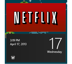
14. Better system integration for charms
When PCWorld contributor Ian Paul recently spent time navigating Windows 8 using the modern UI alone, he found the system integration of the oh-so-crucial charms severely lacking. The Search charm went wonky when he tried sifting through a massive downloads folder, and he wasn’t able to Share a file he found using Search, either. When searching for files (rather than apps), the Search charm frequently says "No results found."The tools are there, they just are not working right, and an unreliable tool is no tool at all.
15. More Live Tile customization options
The Windows Blue leak is already on this case, packing new sizing options that allow you to make Live Tiles itty bitty or ginormous. But again: Why stop there? Give us the ability to select tile colors, Microsoft. Give us the option to choose an image for a tile, or add a bit of text!It would be nice if Windows 8 tried to intelligently position new Live Tiles among similar apps—automatically dumping Twitter into a Social column, for instance—rather than plopping new programs at the far end of the Start screen.
But most importantly, give us an option to disable the creation of Start screen tiles for desktop apps. Every time you install a desktop app in Windows 8 it looks like a geometric bomb went off on your Start screen, as every single possible shortcut associated with the program gets a tile of its own. Main program? Tile! Uninstall options? Tile! Help files? Tile! Program settings? Tile!
The madness has to end.
What else?
Whew! That’s a lot, but it’s all I’ve got. Everyone has theories on what could fix Microsoft’s contentious new OS, though. What do you want to see in Windows Blue? Sound off below.http://www.pcworld.com/article/2035460/windows-blue-wish-list-15-must-see-improvements.html

No comments:
Post a Comment